Colour is one of the things we painters get most excited about - of course!
Colour might attract as to paintings and definitely calls to the painter, but it is not what makes the painting make sense - value does that.
Let me show you what I mean. I’ll also tell you how to alter values in watercolour and tell you something about the colour wheel that just might surprise you.😮
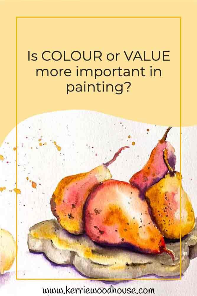
We can make sense of what we see because we recognise its shape. For example, just a simple outline like this tells you it is a pear.

But what happens when we have a whole group of pears?

When we see the line drawing we know that it is multiple pears next to each other.

If they are all green and we paint them, we won’t be able to see the line drawing.
Their combined shape is not so simple.
If the pears were all different colours we would be able to tell them apart.

In real life they are all the same colour and yet we do still see each pear as being separate from one another. How so?
It can’t be colour - it is value.
We can separate the pears in our painting by paying attention to the lights and darks, the different values of green.

Actually it doesn't matter if we use green exclusively or if we add other colours. As long as those colours are in the right value, the pears will still look like pears.
Squint your eyes by closing them half or three quarters of the way. As you do this you see less of the colour and more of just the dark and light. Those are the values of the colours.
Back to those pears...The lightest lights will be where each pear is closest to the light source. As the pear curves away from the light source it will be darker. These are known as form shadows.
Where the pears are touching one another or the surface they are sitting on they will be blocking the light. This creates a cast shadow.
(By the way, if you want to know more about cast and form shadows and how to paint them in watercolour - this article will tell you more and show you some examples.)
This creates a pattern of light, dark, light, dark, light, dark throughout the group which our brains decode (without us even trying) into a three dimensional group of pears upon a table.
Being able to place the darks and lights in this pattern in your pattern will be key to producing impactful paintings.
Value, the darks and lights, are the reason we do not need to see an outline in our painting.
Edges of objects are defined not necessarily by colour, but by relative value.

The pears above are in grayscale - no colour at all. Just like a black and white photograph, colour is not necessary to make sense of the subject.
With no colour at all we are very easily able to identify what it is in the image. This is because the thing our brains pay most attention to are the patterns of dark and light.
We are wired to understand, without even trying, that the different shades of grey on a cube in a black and white photograph tell us that we are looking at a 3 dimensional box.
When your object has a less formal shape with few or no hard edges (like a pear, perhaps) the same principles apply even though they are a little less obvious than say on a cube. The change in values tells us what the three dimensional shape of the object is.
We still automatically understand that an object is curving away from the light source if the values increase.
We know that one object is behind another if we see a shadow of one cast on the other. The shadow deepens the value of the colour of the object.
All of these are examples of the information that value carries which our clever eyes and brains have always automatically know how to decode.
So of course - get excited by colour and make sure you fill your painting with joyous splashes of it.
In fact, let the knowledge that value is delivering the necessary information to identify your subject liberate you in your choice of colour. You can be bold, whimsical and non-traditional in your colour selection, and as long as the values are right your subject will be recognisable.
By the way if you are excited by the idea of painting these juicy pears in watercolour - click here!

Colour carries so much information within it.
It is more than just the colour itself like pink or blue - that is what we call hue. In addition to the hue, colour incorporates the important dimenstion of value.
When you think of it like that you realise that you cannot choose a colour without making a value choice. Even the purest hues have an inherent value (darkness or lightness).
You can actually see your colour wheel, not only as a colour reference but also as a value scale.
The value scale is the range from black to white showing the values in between. This is usually depicted in a linear form. However, if we look at a black and white version of our colour wheel it becomes a value scale!
(If you happen to have your own colour wheel at home, take a quick pic with your phone and then change the filter to black and white to see for yourself!)

When we paint with watercolour, we can always dilute the paint with water to lighten the value (higher value). This works because watercolour is transparent, and the more dilute the paint and water mix is the more of the white paper shows through, effectively lightening the colour of the paint.
We can darken our watercolour (lower the value) by adding more of the same colour effectively making the paint more concentrated, or by adding a darker colour. Add a dark red or blue to your green and you will darken the colour.
We might not use white or black paint in our watercolour paintings, but we have the white of the paper and the inherently dark colours or colour mixes to stand in for black and white and all the shades in between.
Every colour you choose, even in its purest form has an inherent value (darkness or lightness).
If you are working on a dark section of your painting you are just not going to achieve that deep value if you are using Lemon Yellow!
We tend to think of colour and value separately but they are very much related.
While it is true that you can exclude colour, and create a black and white image you can’t exclude value if you want a dimensional subject.
Of course we painters usually prefer colour!
But remember that in choosing your colour you are also choosing the value.
Choose wisely, and bring your paintings to life!
If you would like to bring these pears to life in loose joyful watercolour , you can!
Paint along with me step by step. The pear tutorial is currently available in a juicy bundle of 4 food themed watercolour painting tutorials.
Click on the button below to investigate.

Are you on your own painting journey?
One of these might be useful…


Keep on reading…


